
PLASMA GAMES
From 2021 to 2025, I wore virtually every hat imaginable involving 2D graphics while working at PLASMA GAMES. From print and digital materials, to brand and website design, to game UI/UX and concept art, I did it all. I was promoted from Junior Designer, to Multimedia Designer, and finally to Senior Designer during my 4 years there. Below I have shared some of my best work from my time at PLASMA GAMES. There are mountains of other content that I created at PG, so this is only a tiny curated number of my designs.

PRINT & DIGITAL MEDIA
Much of my time at PLASMA was spent creating and editing printable and digital resources for teachers and students, as well as compiling and editing slide decks and multi-million dollar documents that we would send out to our backers. By the end of my time at Plasma Games, I had created thousands of pages of documentation, fliers, and resources, as well as puzzles and board games that could be printed out and used in the classroom. Below is a selection of documents and resources that I made and designed to fit what ever need arose at Plasma Games. The documentation that I designed is under NDA and cannot be shared at this time.


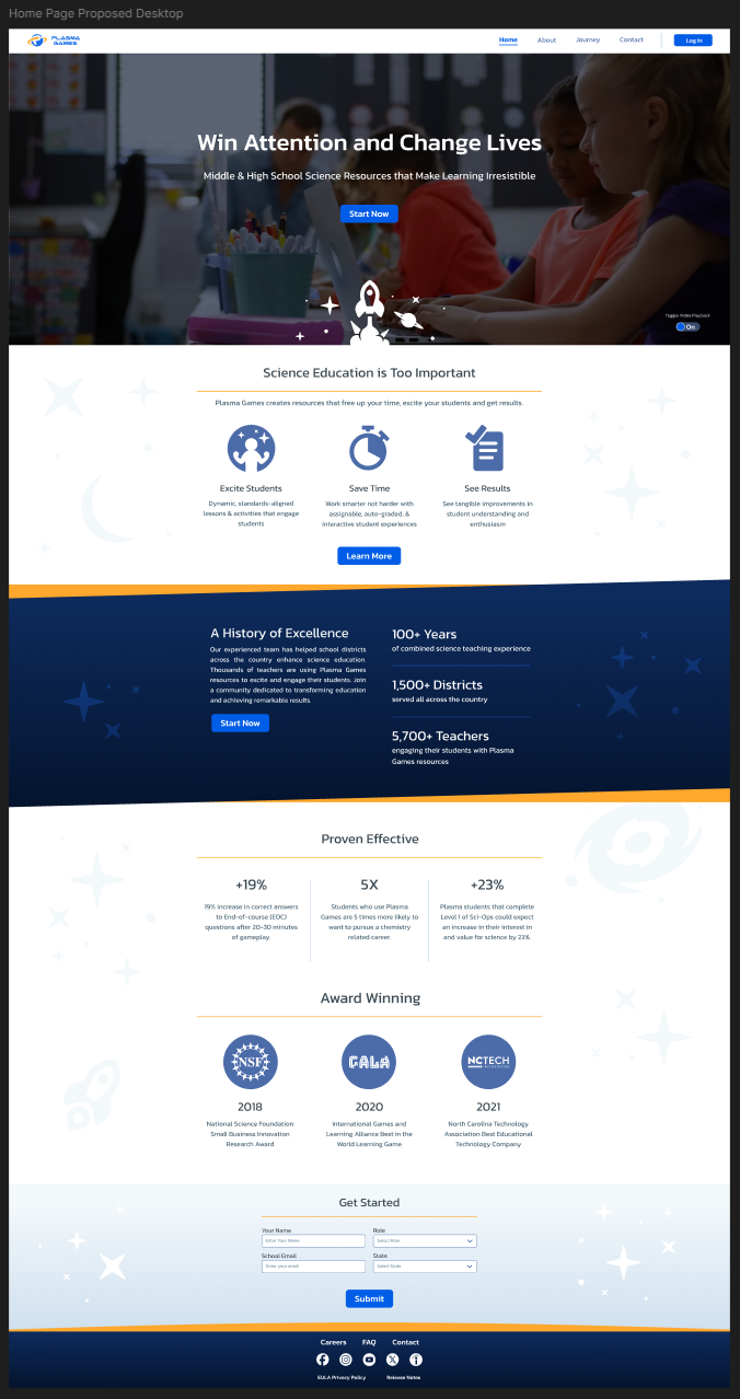
WEBSITE
The website consisted of only 4 main pages, a login page, and a contact and FaQ page. The challenge arose when the content for each page came into question. After collaborating with my coworkers, we were able to condense 2 of the pages into one. At that point I began the work of mocking up the UX in Figma to get a better idea for what the site could look like and how it would function. Below you can see my basic process of compiling the overall UX of the site.

I set to help bring our brand and site to a more professional looking level by redoing and refreshing the overall look of the entire company. The new website was the perfect test subject for such a task. Pictured above are some initial passes at different color-ways to see what would work. Since Plasma Games was an education based company, our site was required by law to be WCAG compliant. What that entailed was all of our colors, fonts, and imagery had to be legible for anyone who had visual or physical impairments like colorblindness or inability to move the mouse..


LOGOS & BRANDING
Plasma Games had many marketing schemes that needed their own identity and logos in order to be successful. There we several design systems that I put together for these marketing pushes, including for Plasma Games as a whole. Curated below are the best of the bunch that I designed during my days at Plasma.


GAMES
Who would have guessed, I made games while working at a game company. There were several games and interactive that I had my hands in, but there was one in particular that I put the most effort and passion into by far. Lost Lexicon was our latest (and last) game that we had endeavored to build. We set out with the goal of creating a vocabulary game that also tested students on scenarios and examples, on top of definitions.
I was tasked with leading the art direction for the project. Our previous games all had a sci-fi look to them, so we knew we wanted to go in a different direction for this game. I ended up going with a darker, more medieval theme for the design and look of the game. Below are the style guides, UI, and concepts that I designed and created.


